
Usability is not an impression, it is arithmetic
For an internal system, the unit is "times per day"
If a data-entry screen is used two hundred times a day, one unnecessary tap is two hundred taps a day, five days a week, for as long as the system lives. Nobody writes that cost down anywhere, which is exactly why it never gets fixed.
Worse than the taps are the mistakes. An interface that makes the wrong choice easy to hit will produce wrong data at a steady rate, and someone downstream will spend their afternoon reconciling it.
For a customer-facing screen, the unit is "whether they stay"
A customer who cannot work out what to do next does not file a complaint. They leave, and you never learn that the screen was the reason. This is the same problem as brand inconsistency: the cost is real and the feedback never arrives.
How we work
We start from the situation, not the screen
Who is using this, where are they standing, what else are they holding, how much time do they have, and what happens if they get it wrong? Those answers constrain the design far more than any style preference does. A screen used at a desk and a screen used outdoors in one hand are not the same screen.
Wireframes and prototypes come before visual design
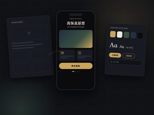
It is much cheaper to find out that a flow does not work while it is still grey boxes. We validate the structure first — what goes where, what happens next — and only then decide what it looks like. Reversing that order is how projects end up beautiful and unusable.
A design system, so screen twenty matches screen one
Most systems do not start out inconsistent. They drift, because screen twenty was built six months after screen one by someone working from memory. A component library and defined states stop that drift, and they make every screen after the first one faster to build.
A worked example: entering weights on a tablet
When we replaced Chang-Fu Rice Drying Center's paper weighing process, the hard part was not the database. It was that the person entering the data is standing next to a truck, outdoors, in daylight, possibly wearing gloves, with a queue behind them.
That situation dictates the interface: large touch targets, a short path from opening the app to a saved record, values that are hard to mis-tap, and legibility in glare. None of those are aesthetic decisions — they come straight from where the screen is used.
The system side of that project is described on the ERP system development page.
What a project usually covers
- Watching the work happen, and talking to the people who will actually use it
- Flow and information structure before any visual decisions
- Wireframes, then a clickable prototype to test the flow with real users
- High-fidelity interface design, inheriting from your brand identity
- A component library and state definitions the engineers build from
- Accessibility basics: contrast, touch target sizes, keyboard and screen-reader support
Who this is a good fit for
Teams with a screen that is either used constantly by staff or relied on to convert customers — and where somebody already suspects it is costing more than it should. If you can name the screen people complain about, that is usually the place to start.
If your product has no users yet, formal user research is premature — build the thing and put it in front of someone. We would rather say that than bill you for research with nobody to research.
Interface work inherits from identity, so if the visual language is not settled yet, the two are usually done together — see brand identity design.