
Why it drifts in the first place
Almost never because anyone did bad work. It drifts because each piece was made at a different time by a different person, each one guessing from whatever came before it.
The website was built three years ago by one company. The business card was typeset by the print shop. The signage shop scaled up the logo from the card. The presentation template came from whoever needed a deck that week. Each step is one small compromise away from the last — and small compromises compound.
The second cost is quieter but more expensive: every time you need something new — an event poster, a quotation template, a booth backdrop — somebody has to decide the colours and the typefaces all over again. You pay that decision again and again.
How we work
Logo refinement, not necessarily a redesign
Most companies do not need a new logo. They need the one they already have to survive being shrunk onto a card, embroidered on a shirt, and rendered at 32 pixels in a browser tab. We start by auditing what you already own, and only rebuild what genuinely cannot hold up.
Physical applications are designed, not left to the vendor
Business cards, envelopes, presentation templates, signage. These are where identity usually falls apart, because they are the pieces most often handed to whoever is printing them. We design them as part of the same system rather than as afterthoughts.
The digital side comes from the same decision
This is the part most identity studios hand off and most web agencies improvise. Because our visual-identity designer and our engineers are on the same team, the colour on your website and the colour on your card are one decision, not two guesses. Interface components, states and typography inherit from the identity instead of approximating it.
A guideline document someone will actually open
Not a 90-page brand bible nobody reads. A short, practical document that answers the questions people actually ask: which colour value, which typeface at which weight, how much clear space, what to do when the background is dark. Written so that your next vendor — one we have never met — can follow it without calling us.
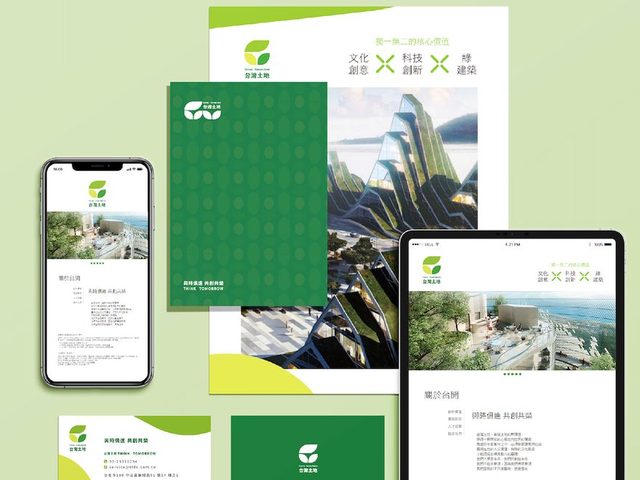
What a project usually covers
- An audit of the visual assets you already have, and an honest view of what is worth keeping
- Logo refinement, and reproduction rules for small sizes, single colour and dark backgrounds
- A defined colour and typography system, specified for both screen and print
- Physical applications: business cards, envelopes, presentation template, signage direction
- Digital extension: how the identity behaves as interface components and states
- A guideline document your other vendors can work from without us
Who this is a good fit for
Companies with more than one touchpoint that has to look deliberate — a website and a card and a storefront and a deck. The value we add is consistency across media, and that value only exists when there is more than one medium.
If all you need right now is a logo on its own, a studio that only does logos will be faster and cheaper than us. We would rather tell you that than sell you a system you have nowhere to apply.
Identity work also pairs naturally with a site rebuild — if the website is the first place the new identity has to live, it is usually cheaper to do both at once. That side is described on the website development page.